This project demanded end to end design work covering everything from logo, branding, packaging to social media and other essentials. The client had a certain pre-existing broad aesthetic approach in mind, I shared some references and together we were able to take off with a clear, mutual vision.
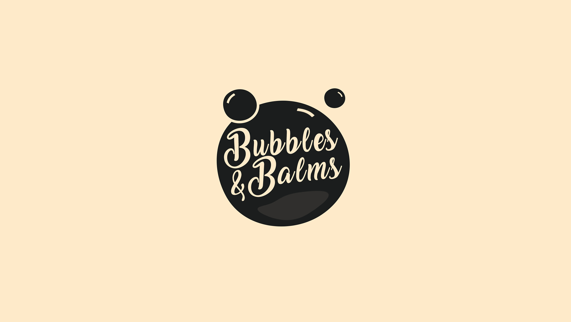
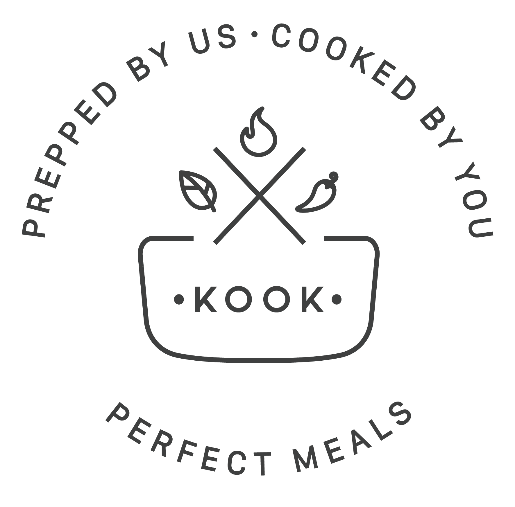
I started with the logo, attempting to represent the concept of a meal kit as requested by the client owing to the relative newness of the product for the Indian market. The goal was to make a clean, petite icon that's communicable to a wide audience and in line with the desired aesthetic.


And we reached here for the final version :
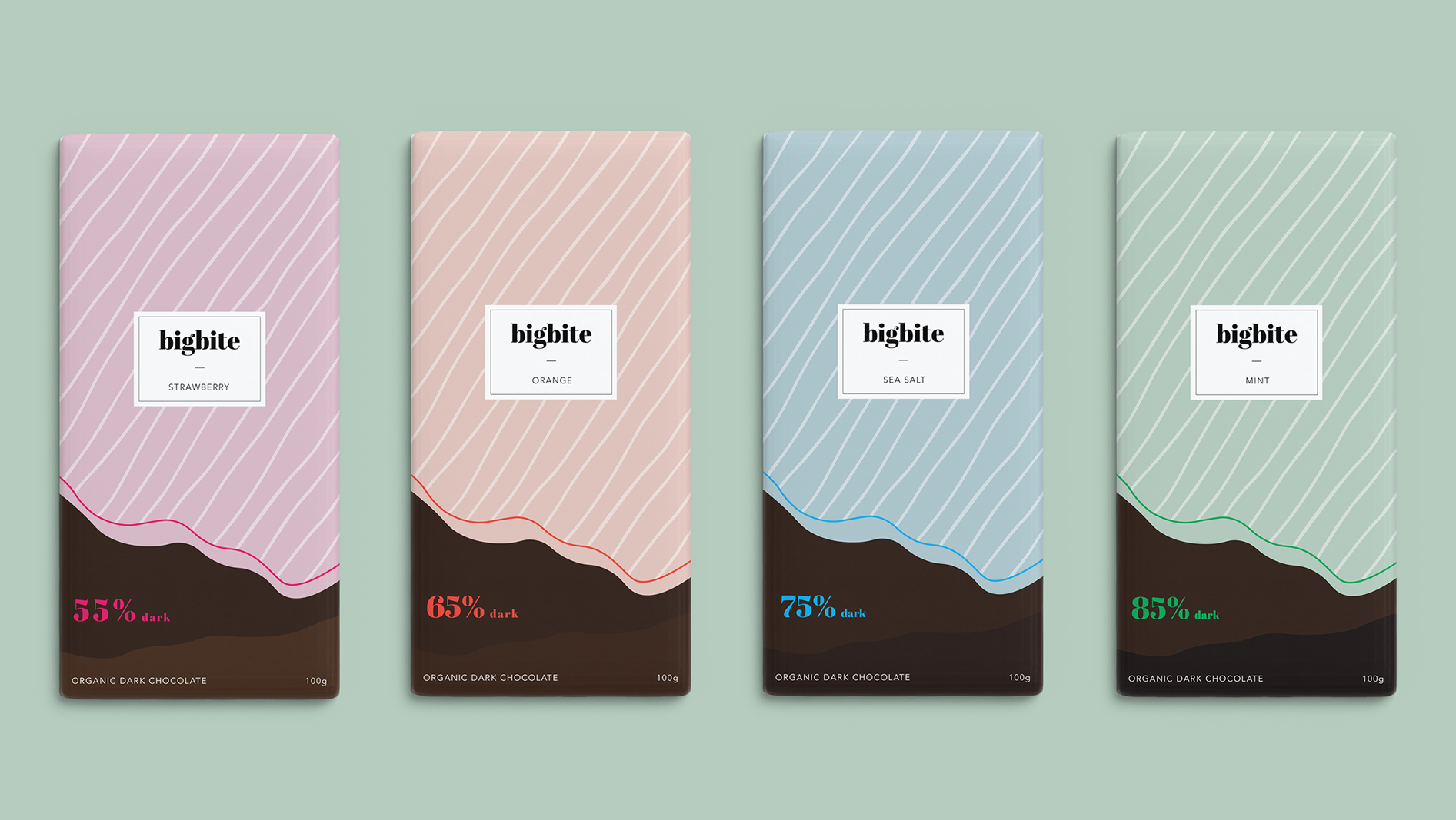
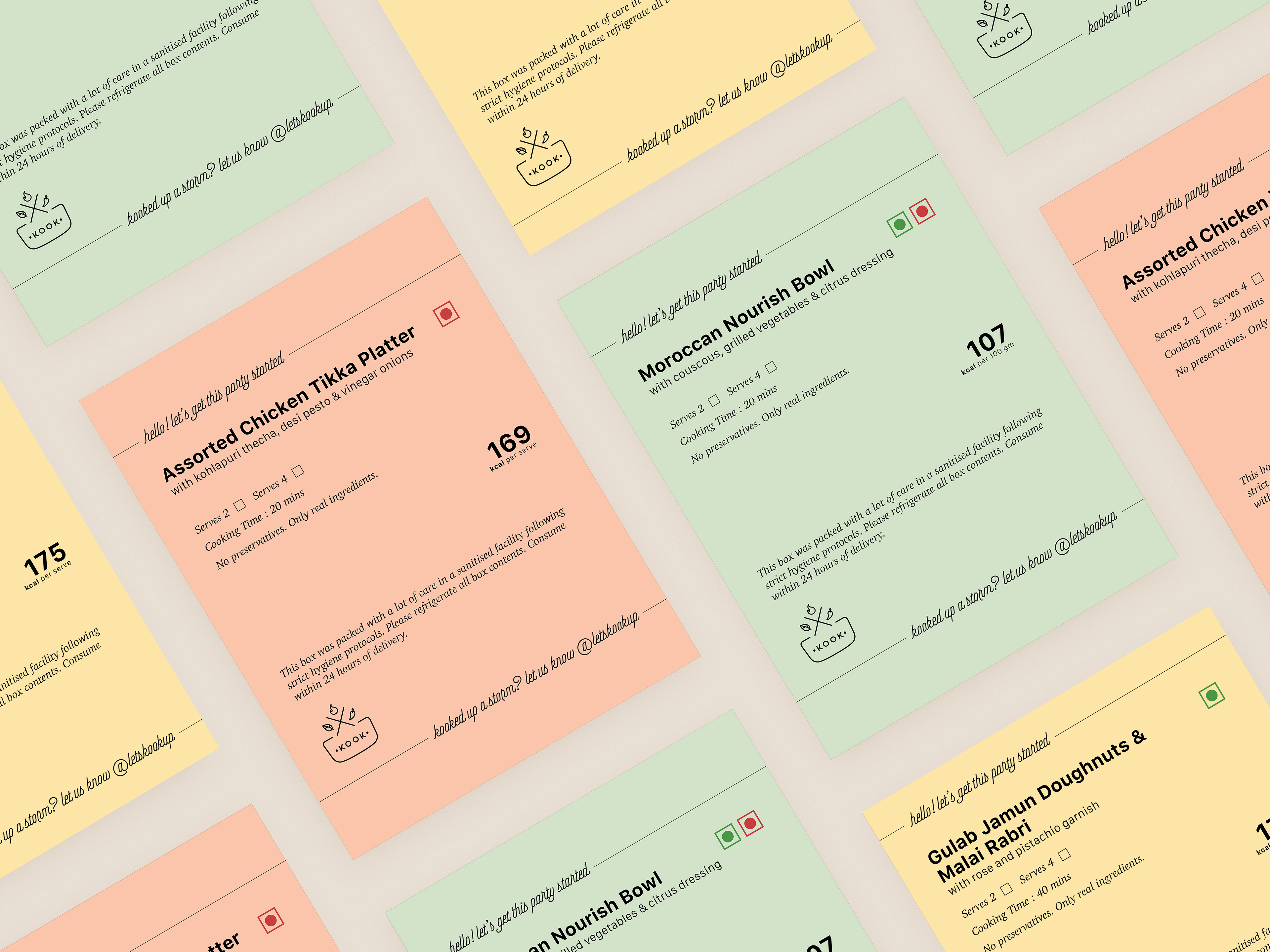
The next step was to make a brand colour palette. This was aimed at creating something that speaks for hygiene, food, and is not intimidating. I shared multiple options and a calm, soft, pastel colour palette was finalised with food-friendly hues.
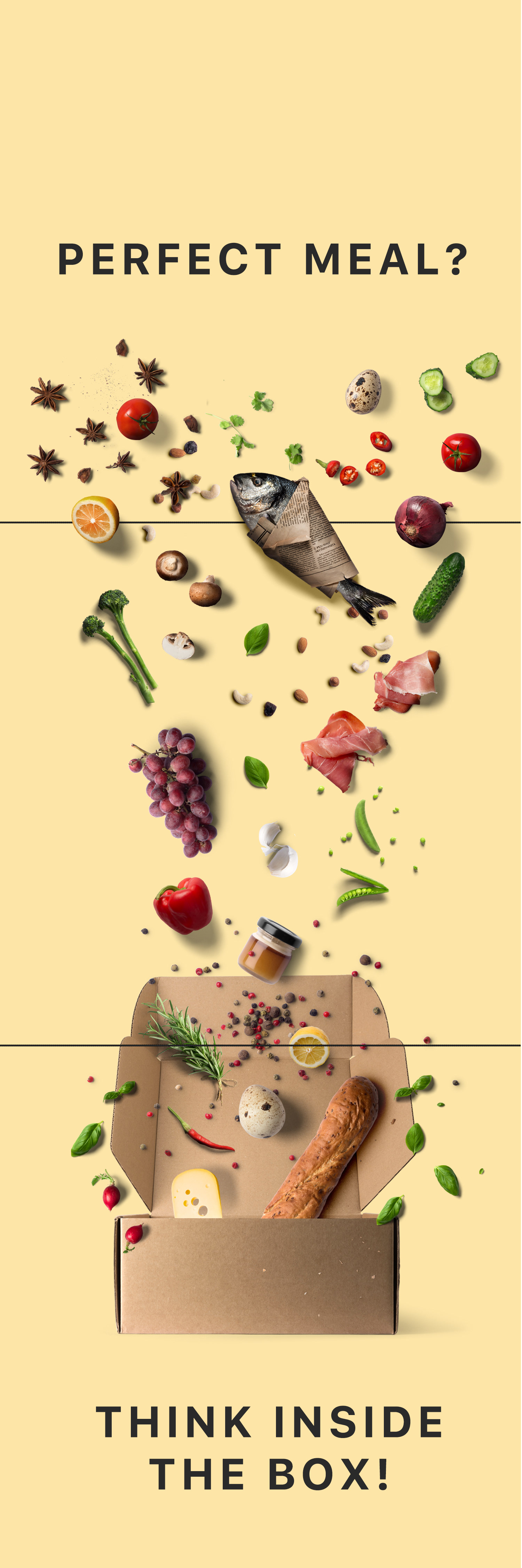
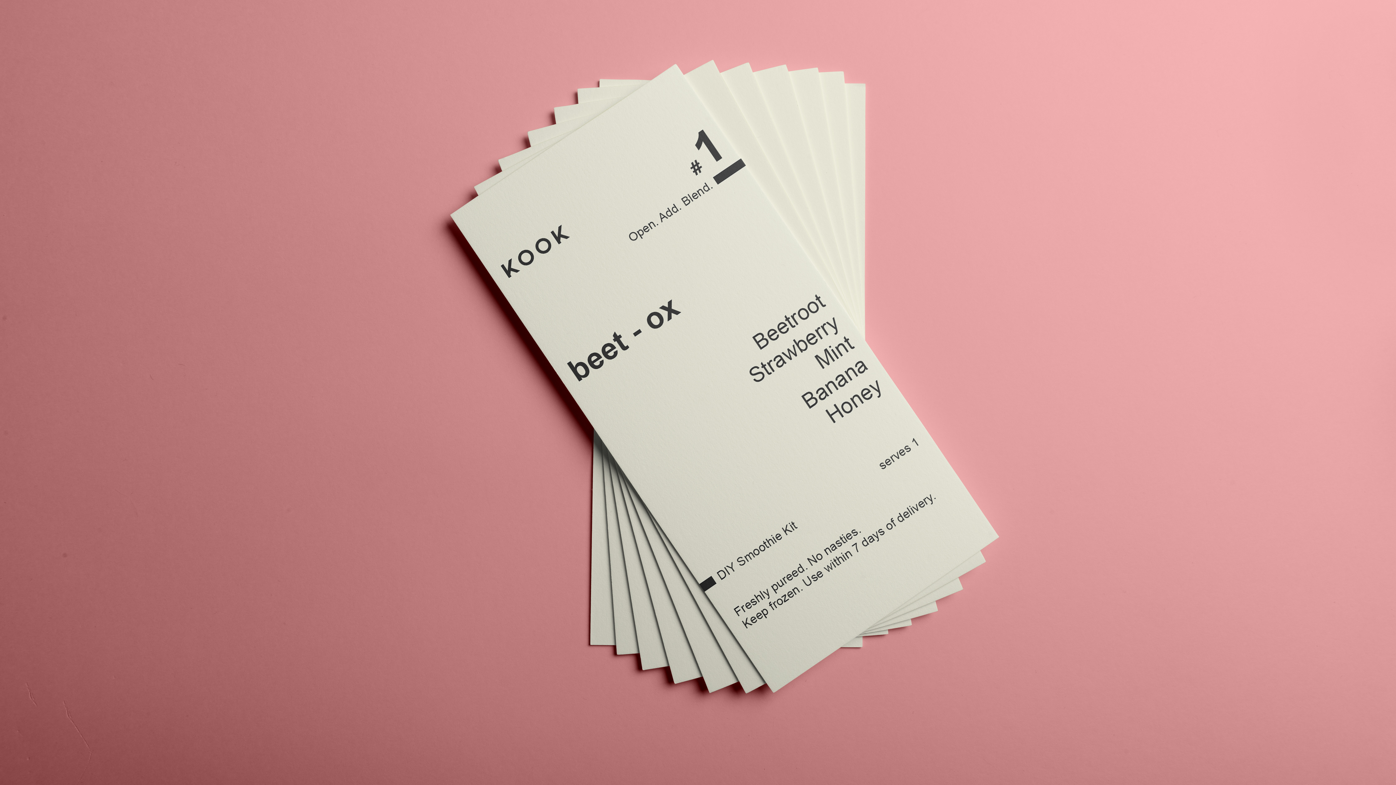
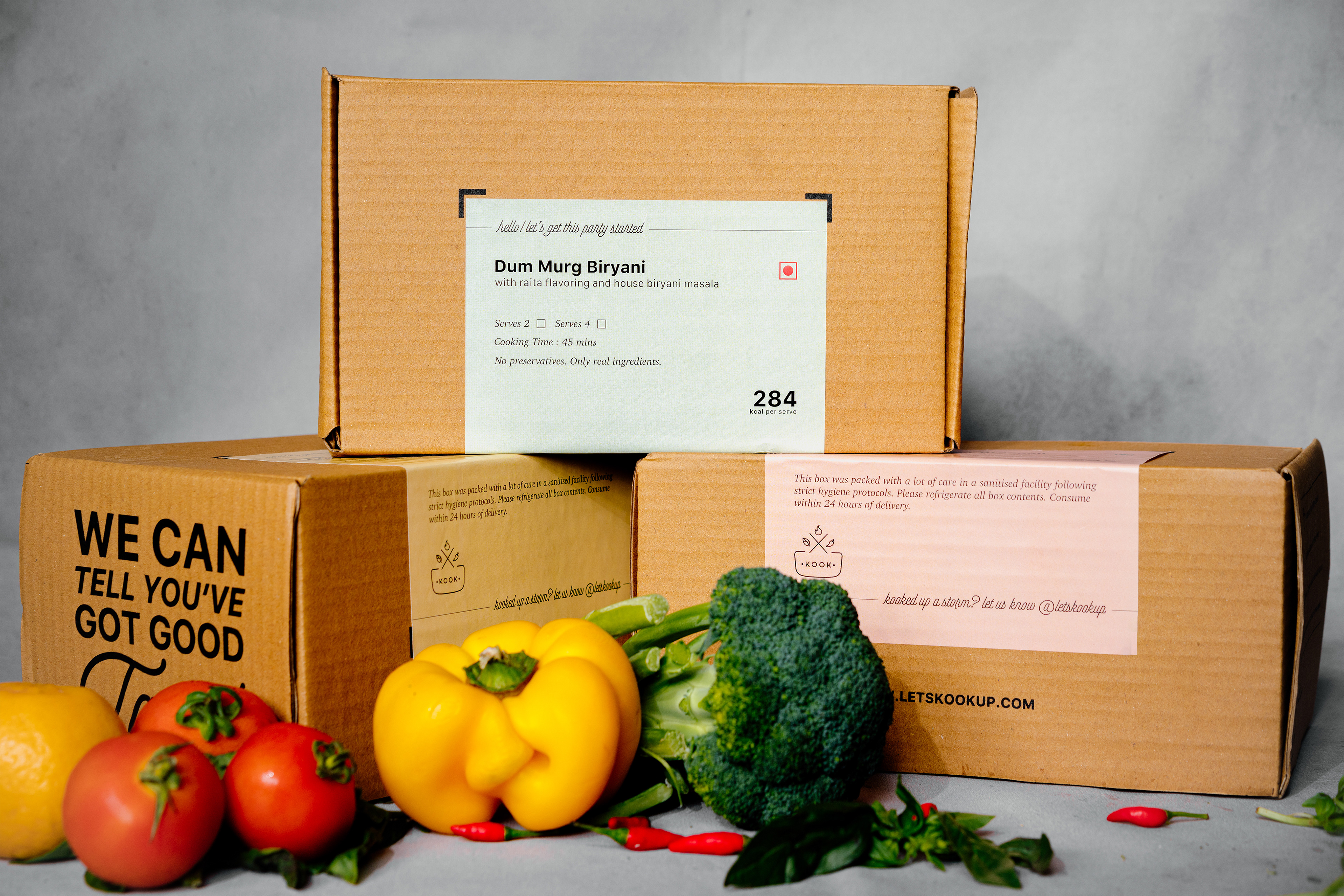
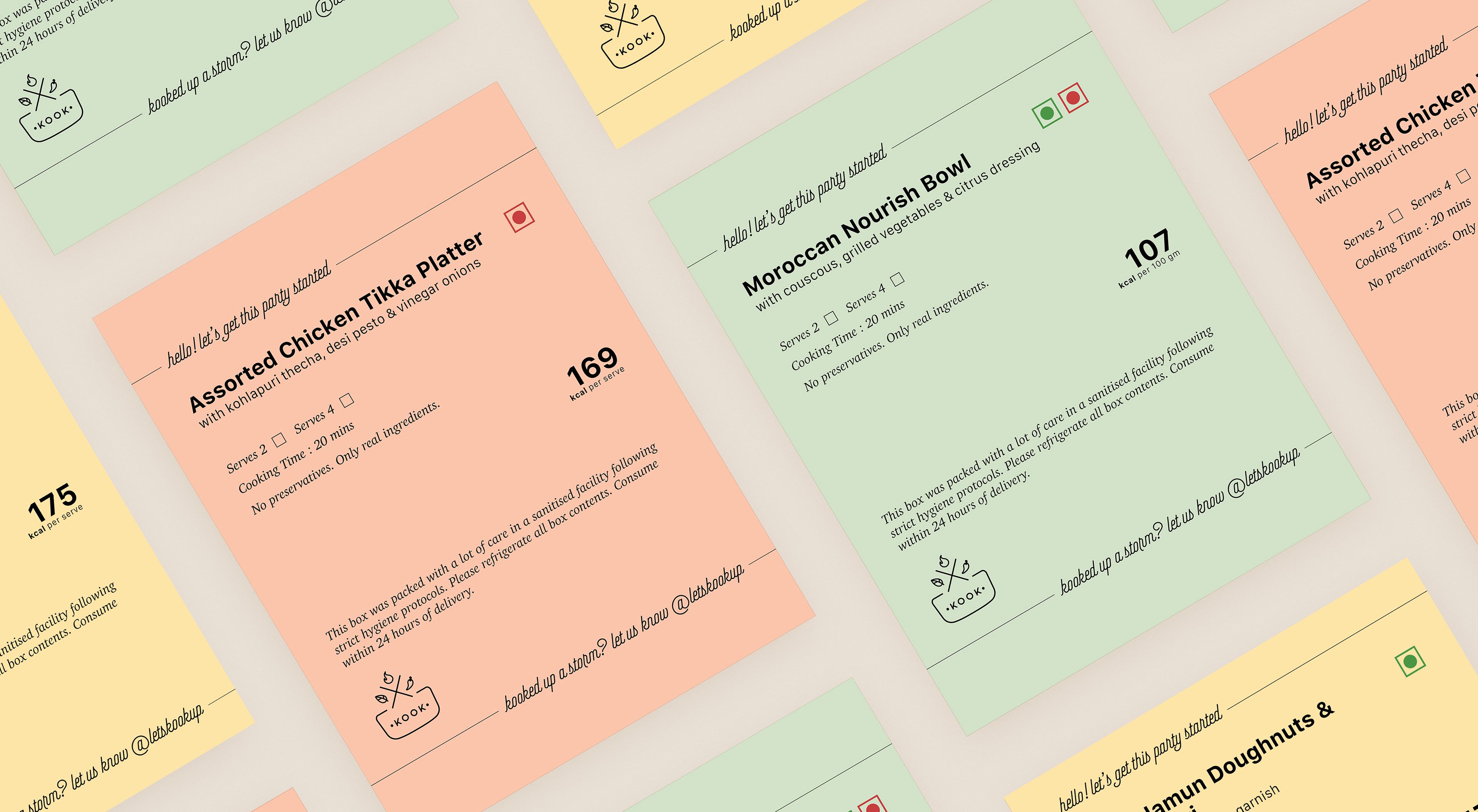
Now, for the packaging, the task was to design something cost-friendly, applicable on a corrugated box, and feasible for any worker to manage and execute. We decided to make a matte-finish printed sticker using the colour palette and again, attempted to make something clean, communicable, and calm. A text-based approach was adopted for the same using suitable fonts and spacing.
Now that the general brand guideline and primary assets had been executed, we moved on to make some other essentials.
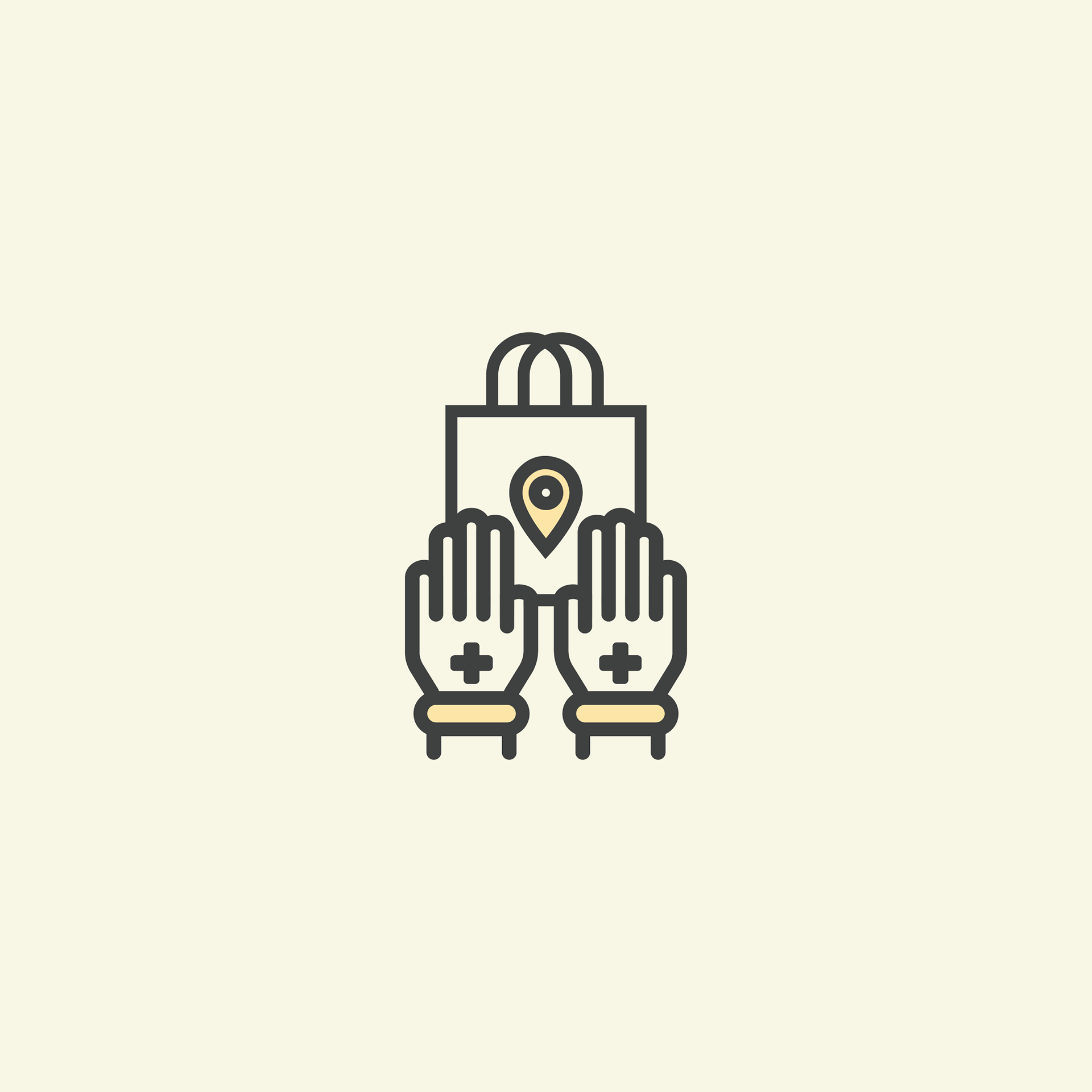
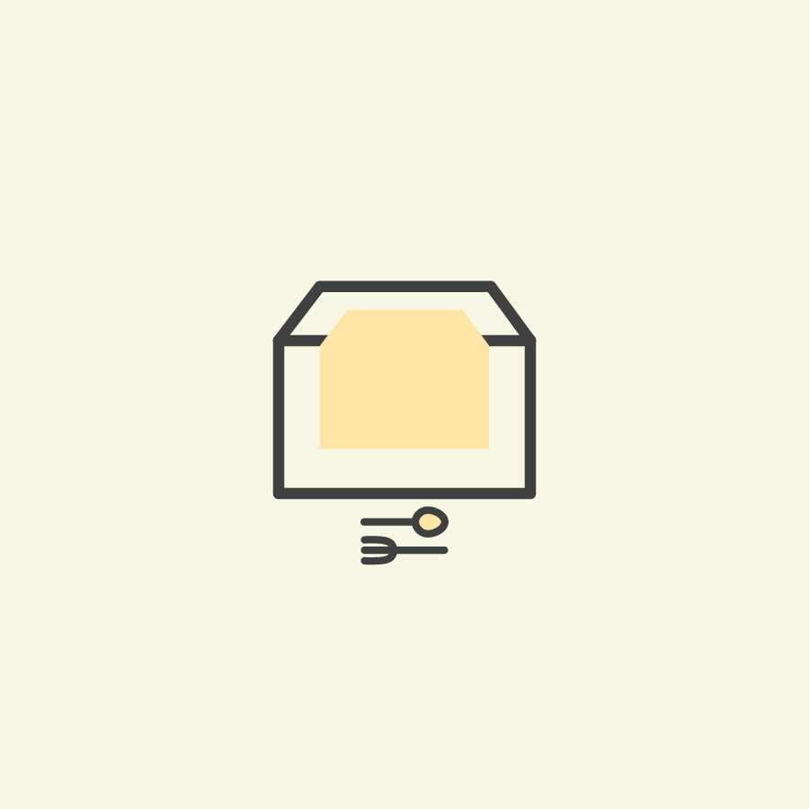
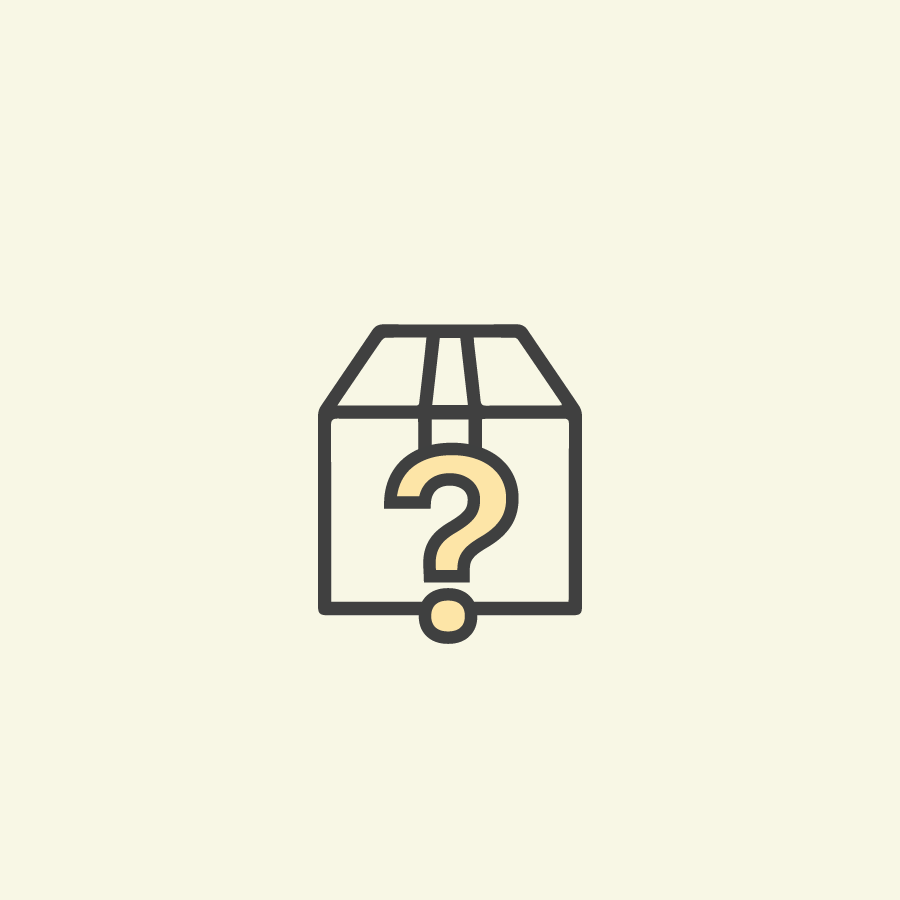
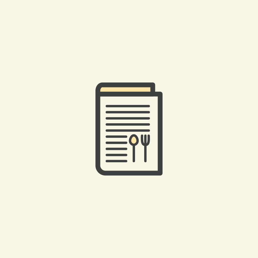
Icons (for web & Instagram)


Graphic for Instagram