![](https://cdn.myportfolio.com/6d4bafd0-c7f6-433e-8e21-3778b79f984f/e2be4b59-de65-47cc-ab07-d3a651d9b2c8_rw_3840.jpg?h=b5822a1a855d9781bf49ee0435c7c44f)
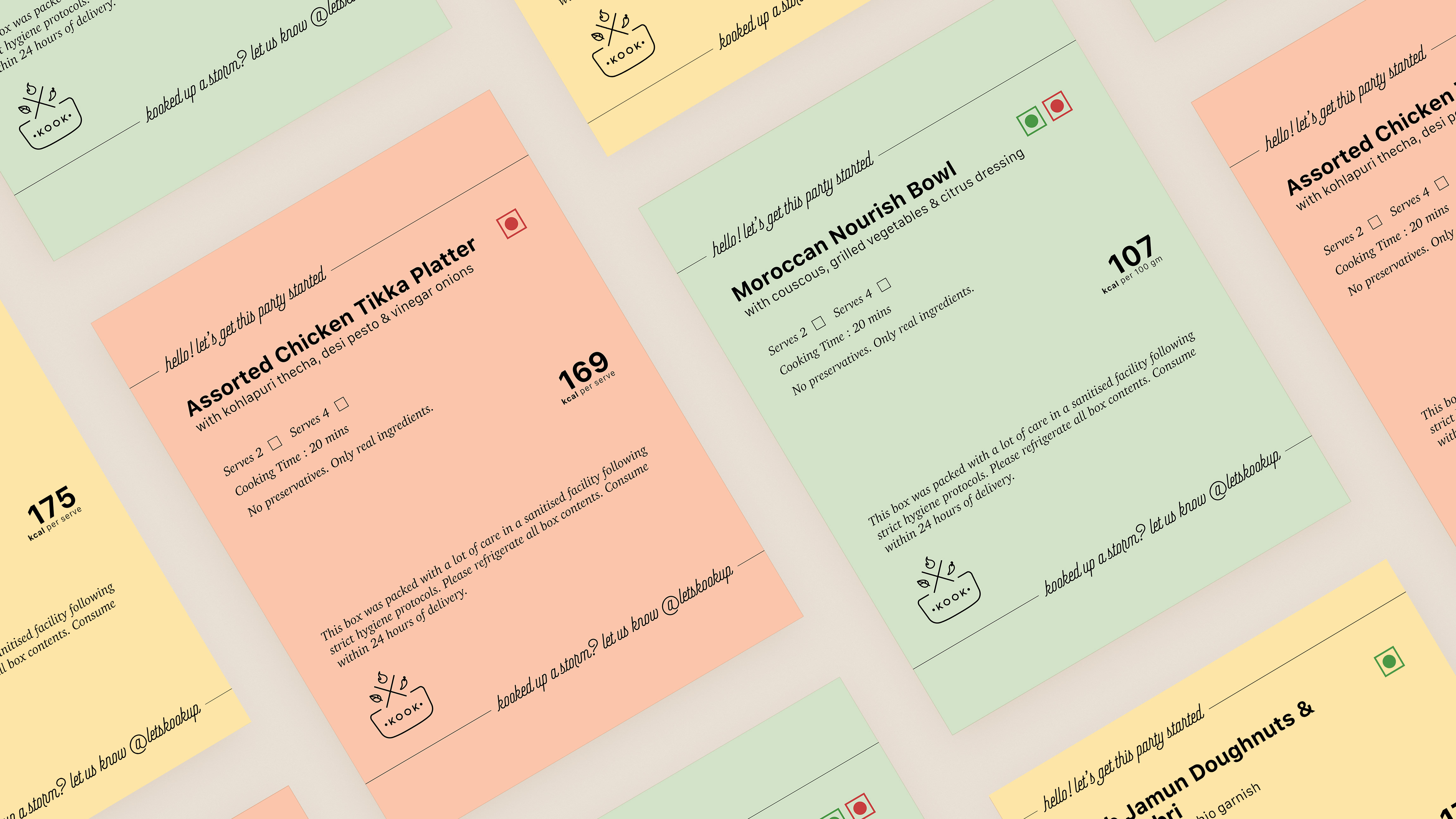
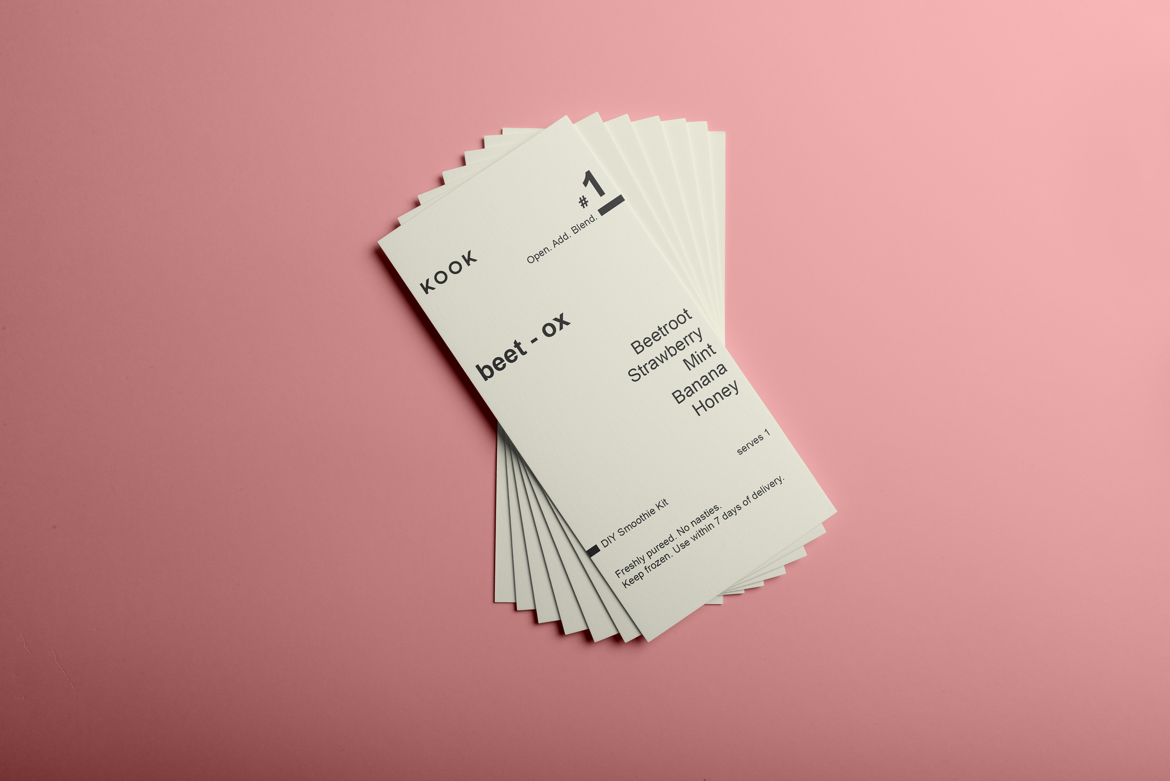
The brief was to go minimal and communicate the essential information clearly. So I opted for a neutral tone and again, a simple text-based approach. I used the font Arial (no shame) and maintained Kook's logo without the icon this time.
![](https://cdn.myportfolio.com/6d4bafd0-c7f6-433e-8e21-3778b79f984f/da3f0281-8410-49e0-9d1f-07fb8f279c29_rw_1920.jpg?h=a66db79f857f0a7015beb159f222dcf2)
![](https://cdn.myportfolio.com/6d4bafd0-c7f6-433e-8e21-3778b79f984f/7dd8f1b0-c461-417b-a47d-76c2ae271b16_rw_1920.jpg?h=61b190f5788b291e4fee6def25ad4612)
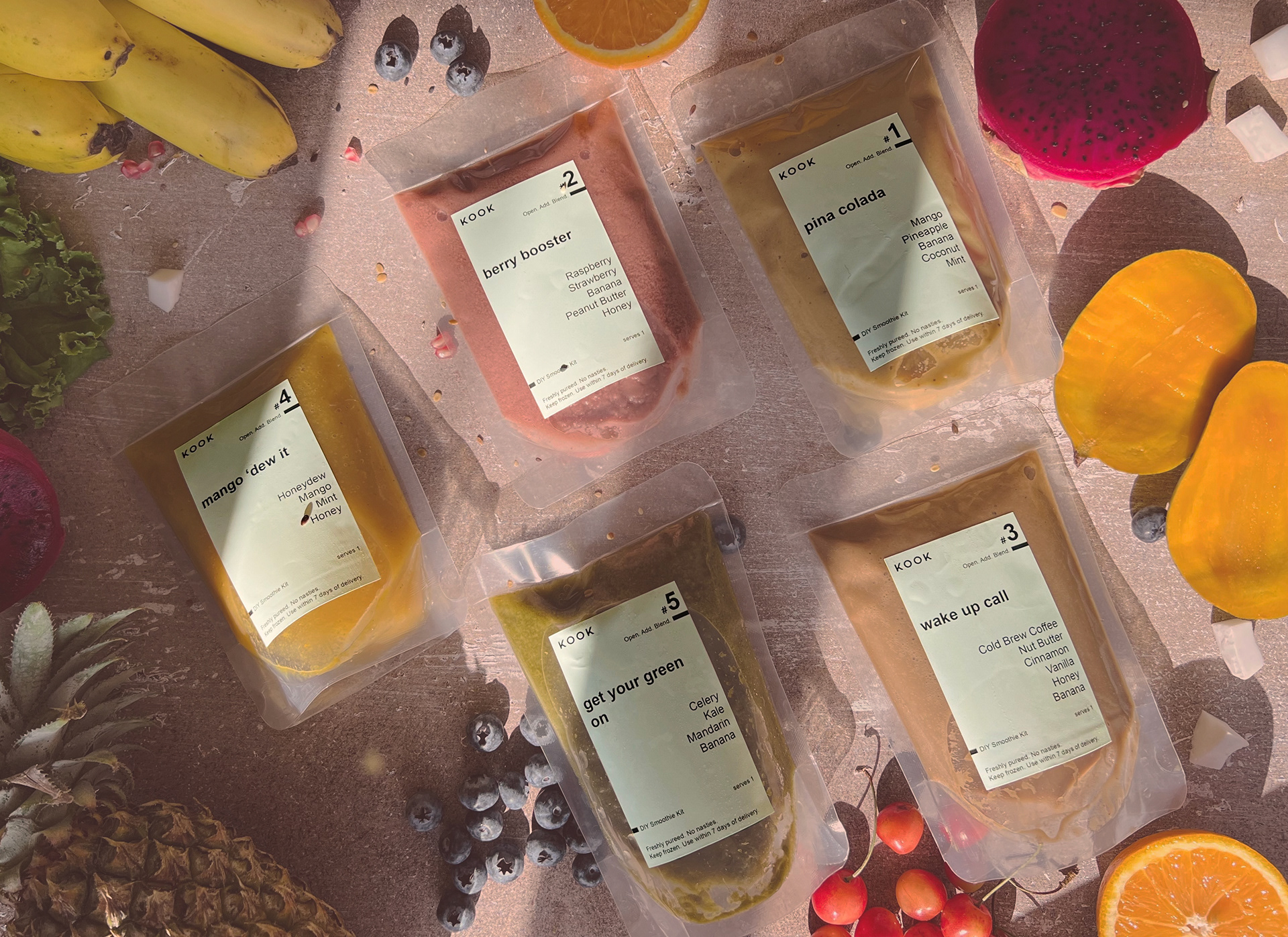
A year and more after working with the food startup, Kook, for their end-to-end design, I was asked to design labels for their new DIY Smoothie Kits.