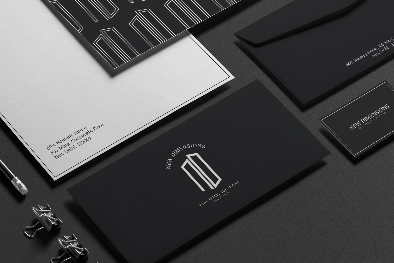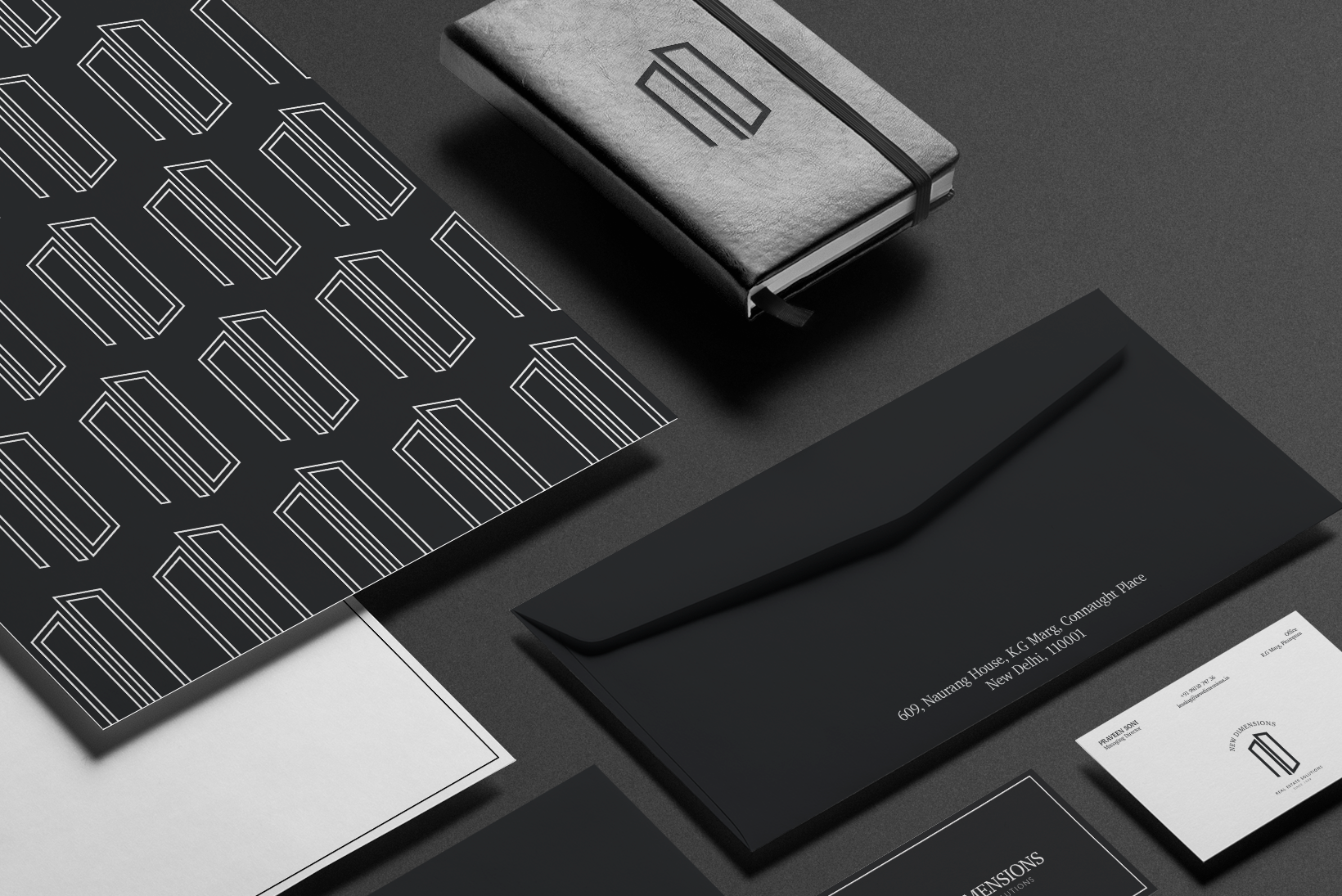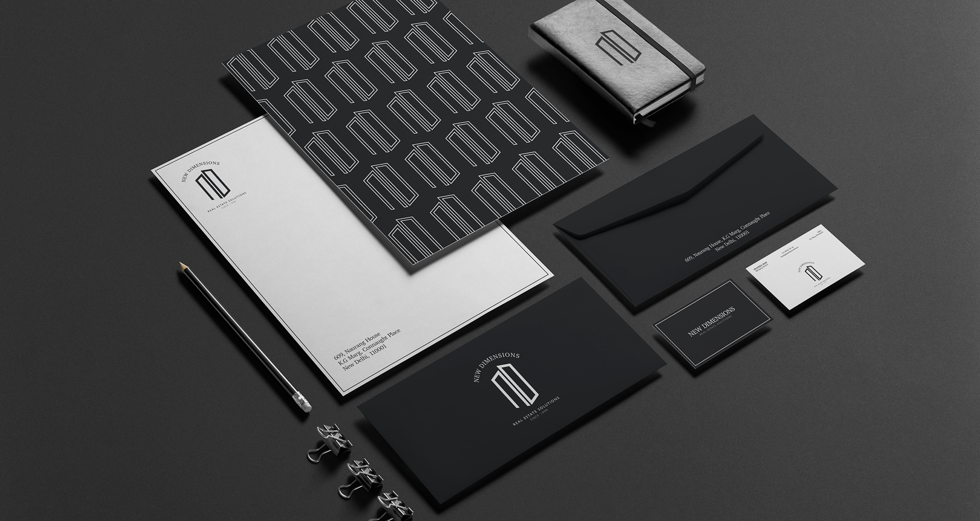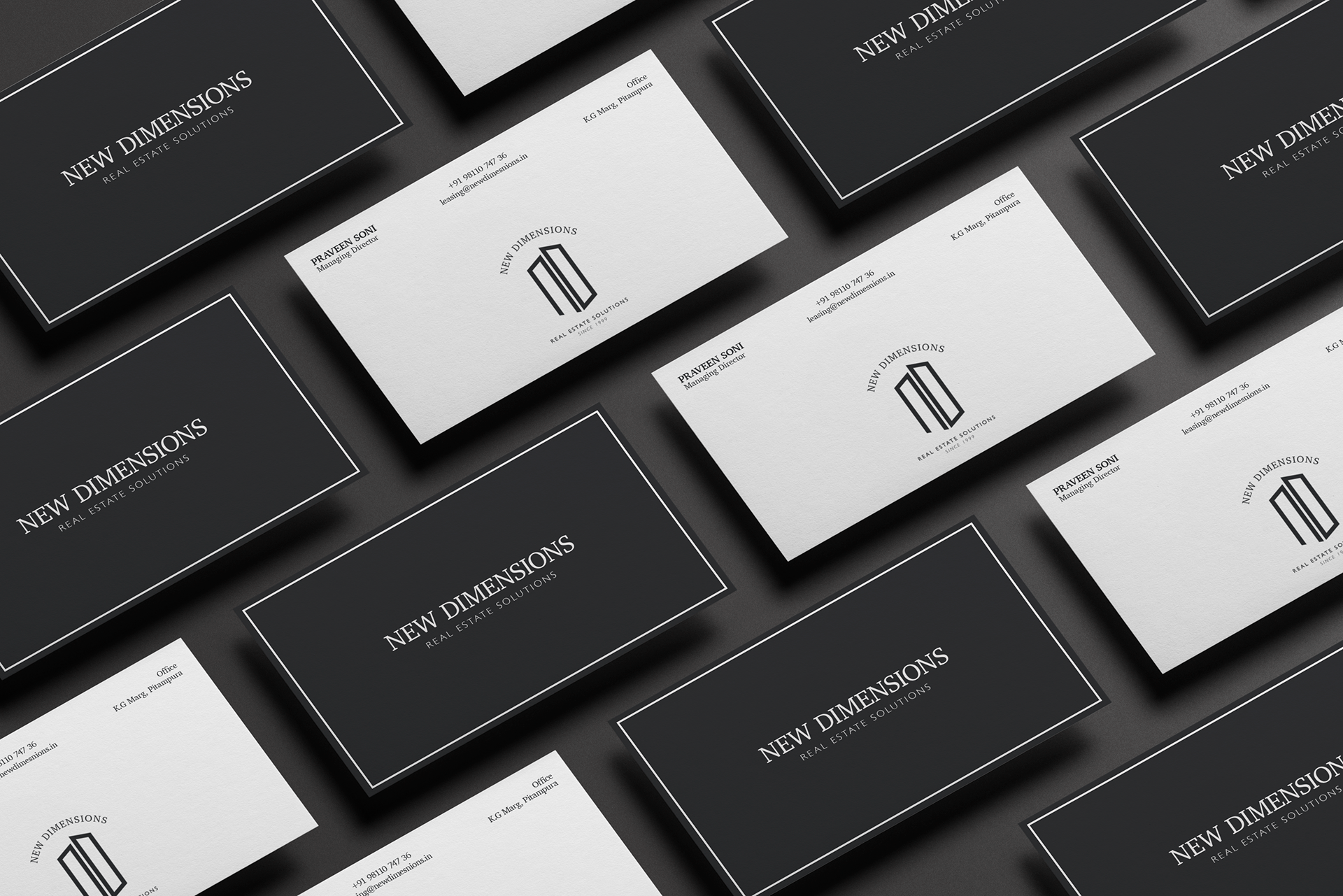
Staying true to the company's area of expertise, the logo was designed within the framework of a commercial building. I attempted to translate that structure into a minimal, sophisticated corporate design taking the form of the company's initials, i.e, ND.

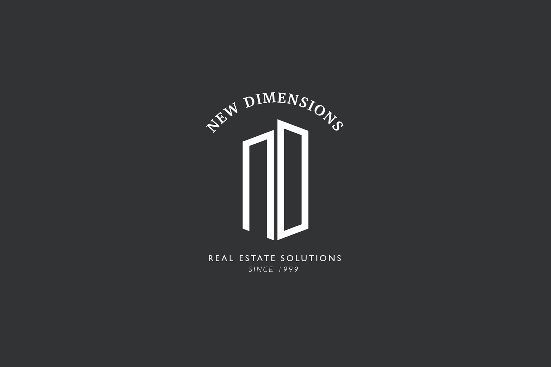

Stationery and other elements were designed using a dark neutral palette, a serif font for the title to blend with the corporate seriousness and evoke the desired trust and confidence.