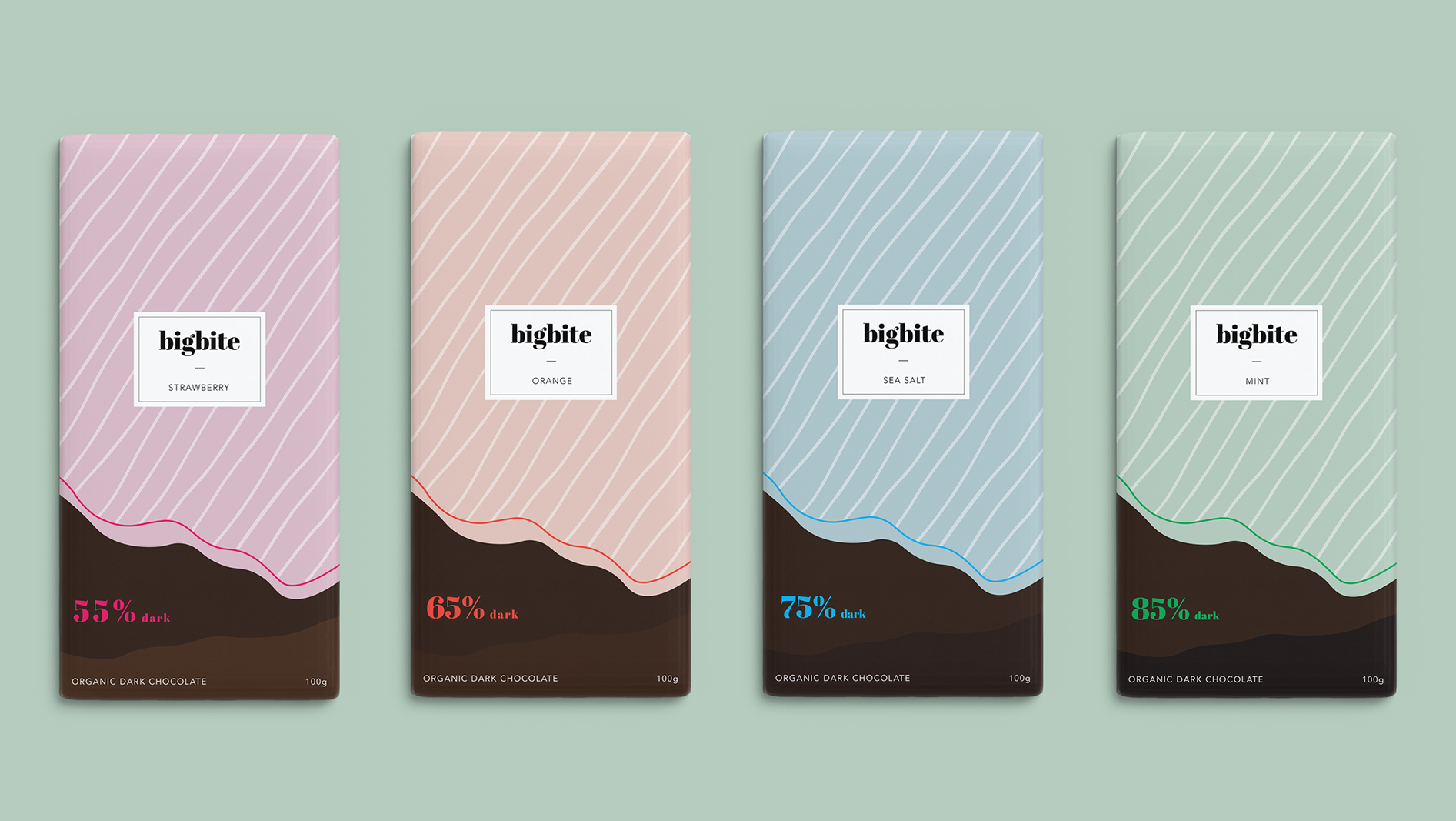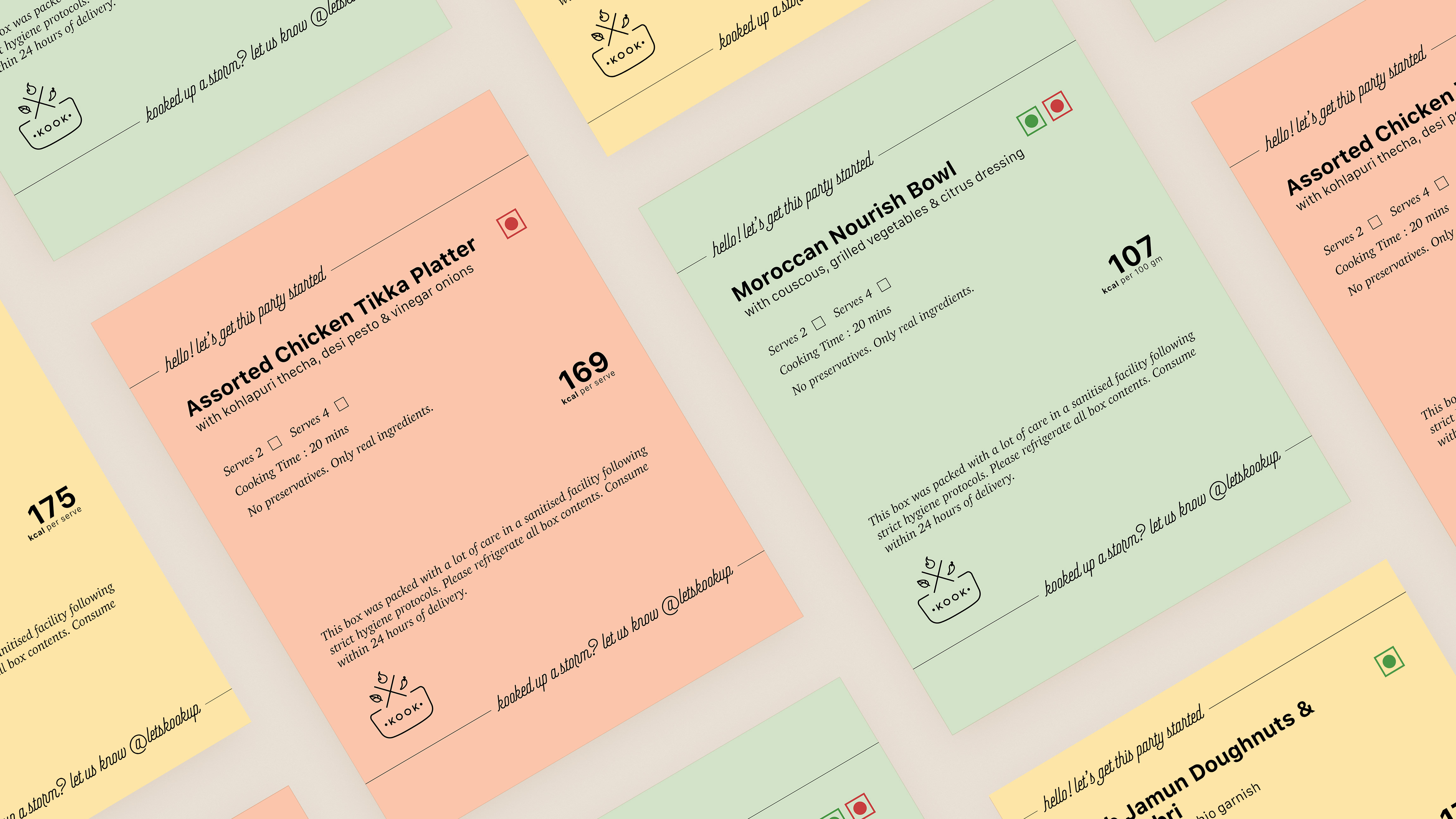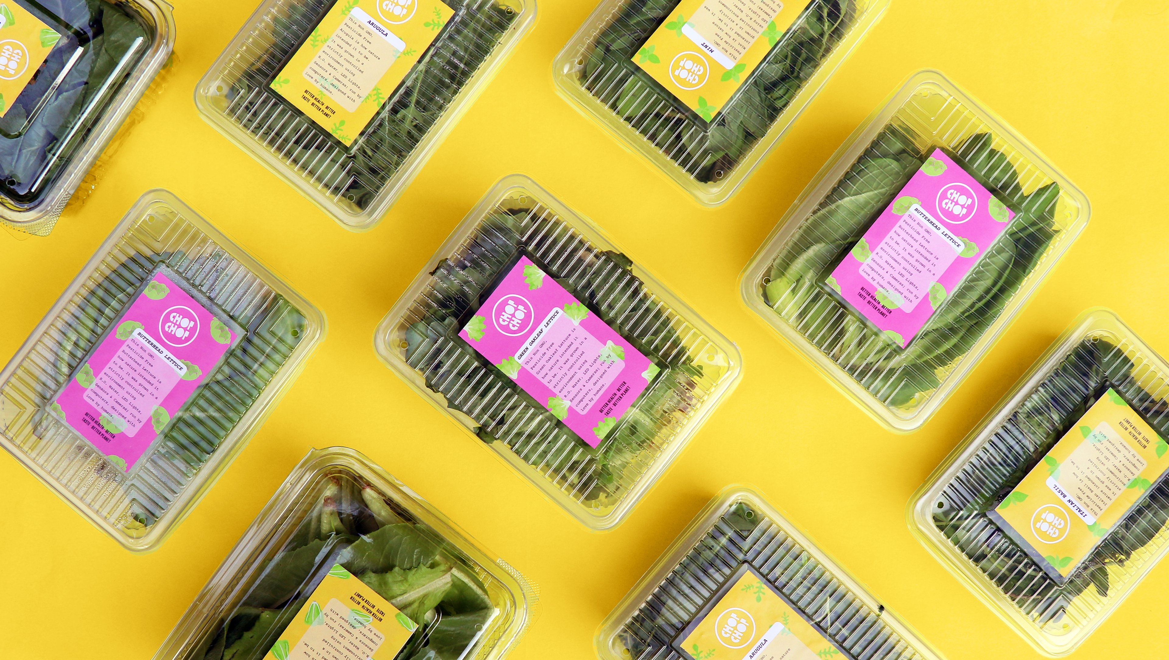
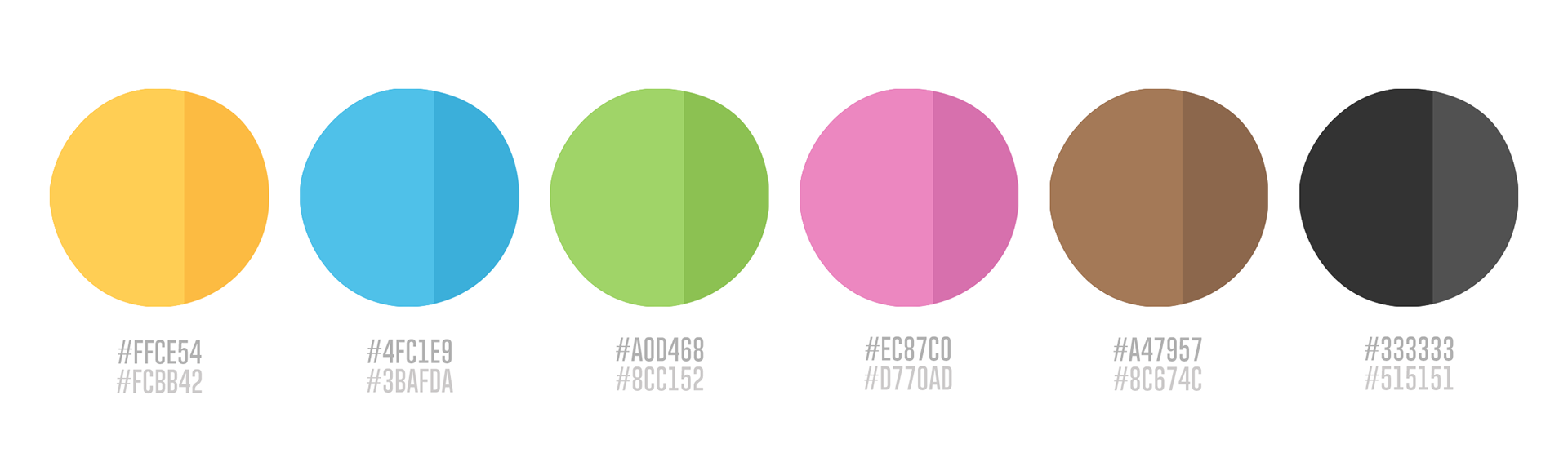
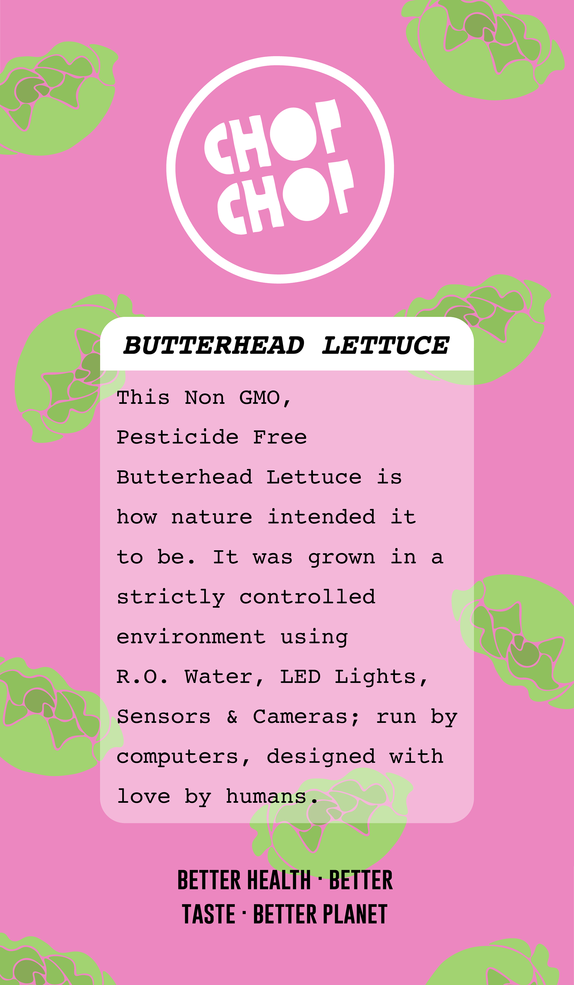
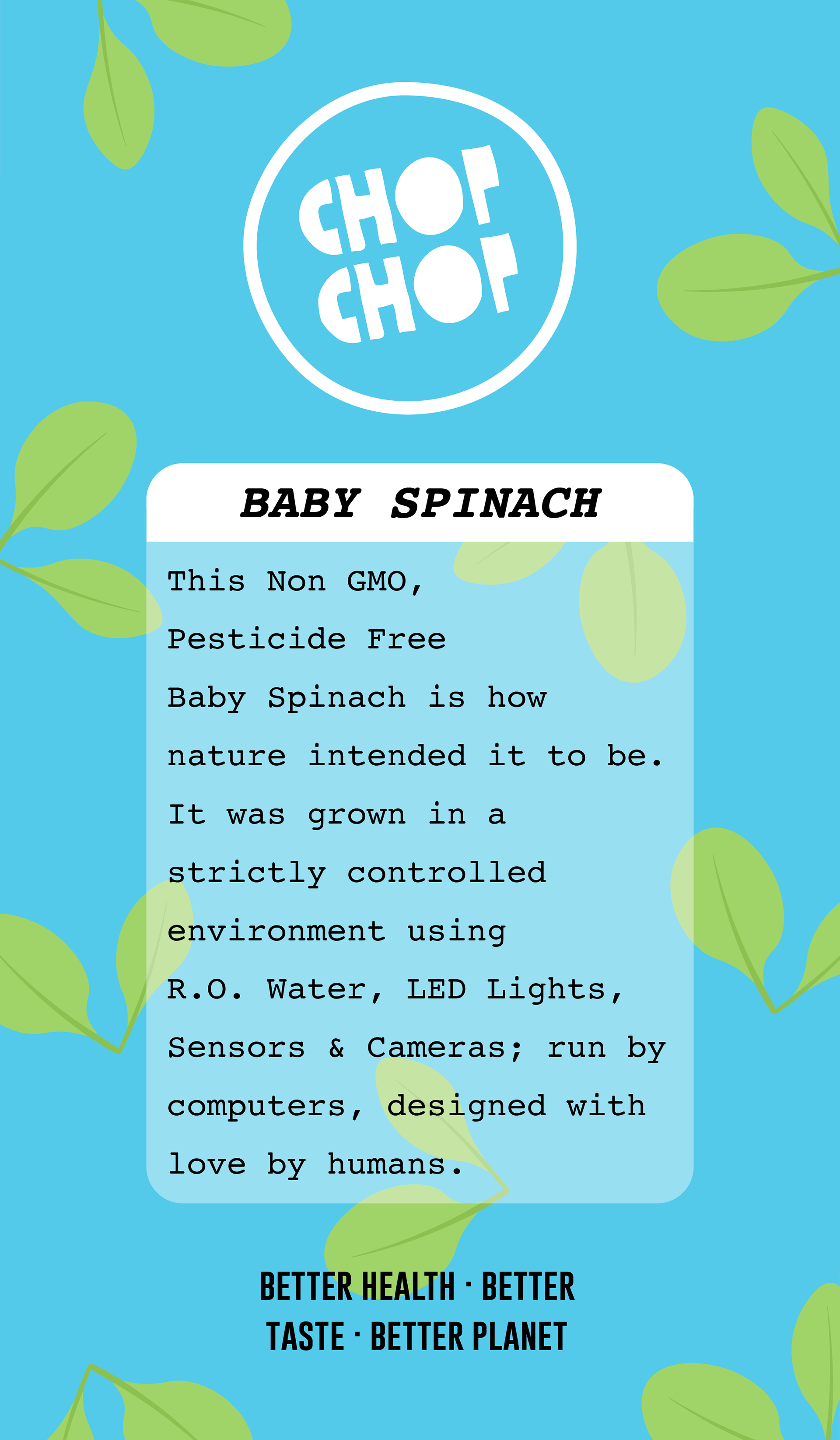
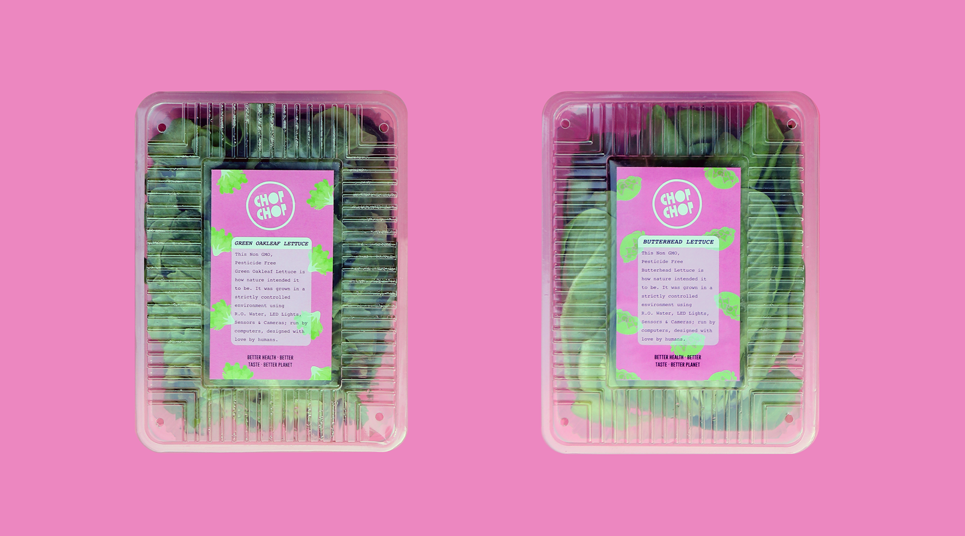
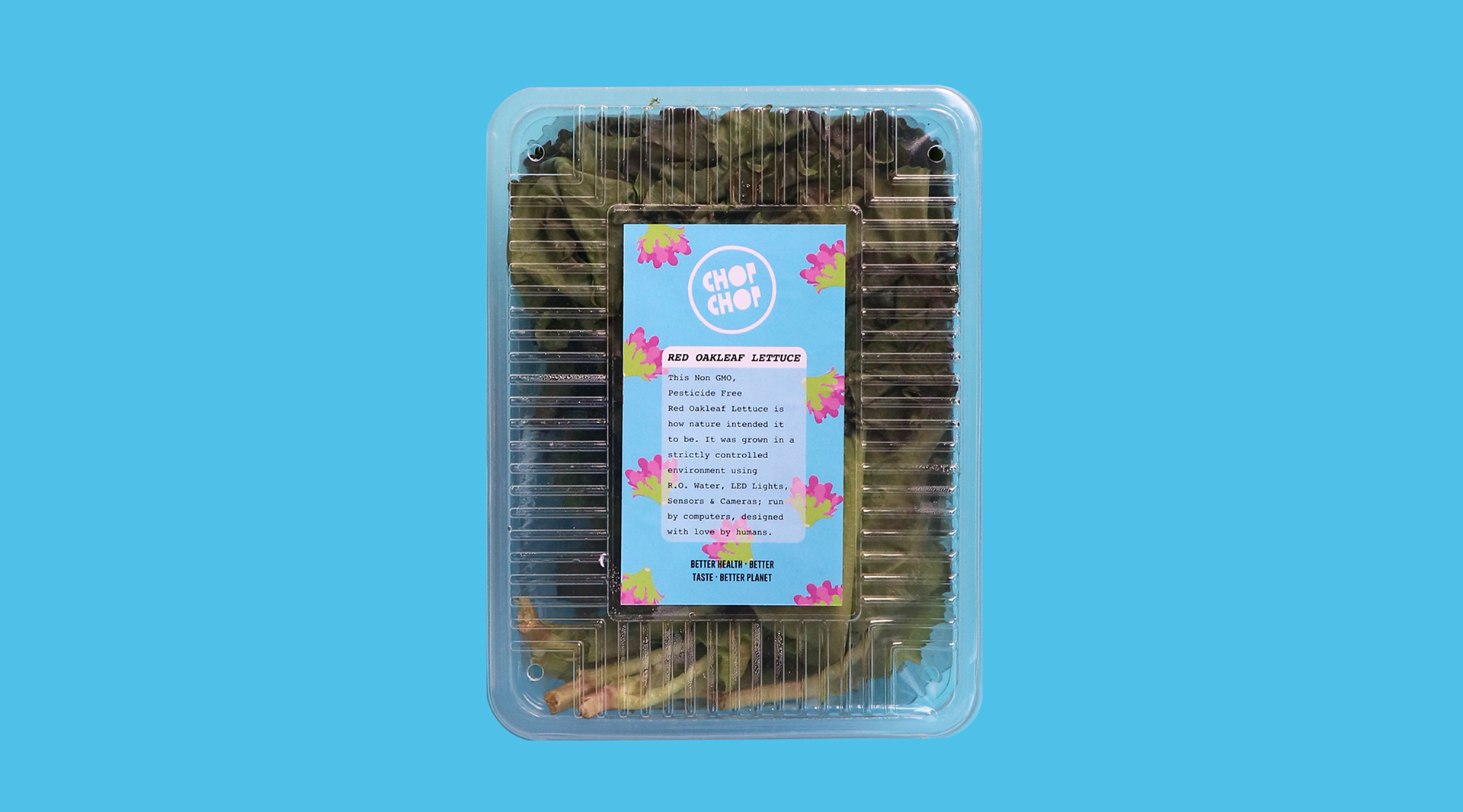
The first step involved creating a colour palette that spoke for the brand's ethos and adhered with the client's vision. The attempt was to get the right amount of fresh, pop and hygiene.
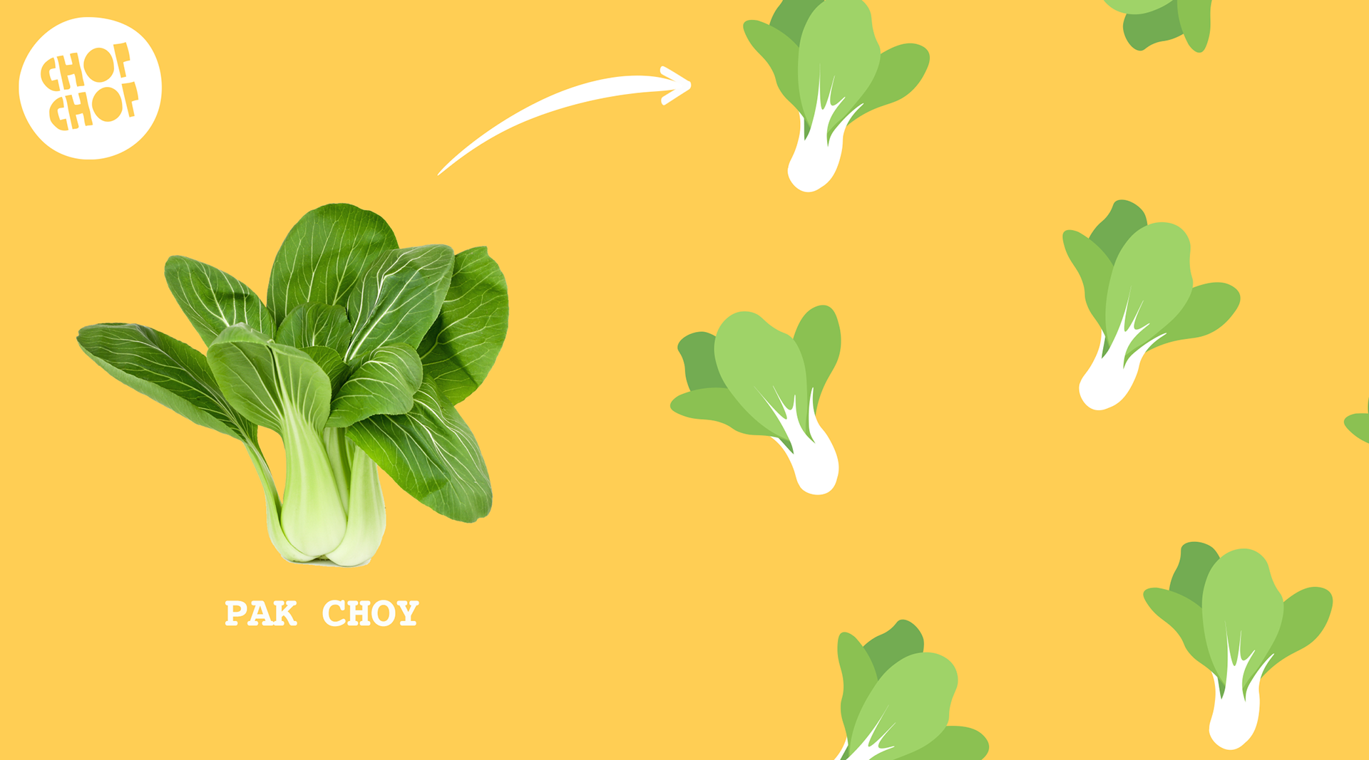
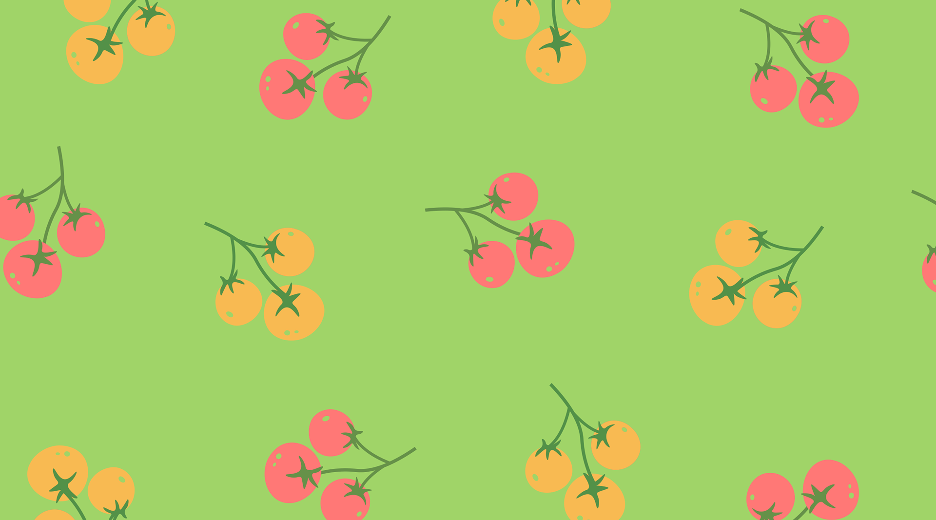
The next step was creating product illustrations, a key aspect for the overall branding. Since the brand had a pre-existing logo to be incorporated in the new identity, the illustrations were carefully made in line with the aesthetics of the logo and the brand's organic intentions. So, I opted for a non-geometric, curvy design language with flat colour tones for the intended effect to appear soft, healthy and trustworthy.
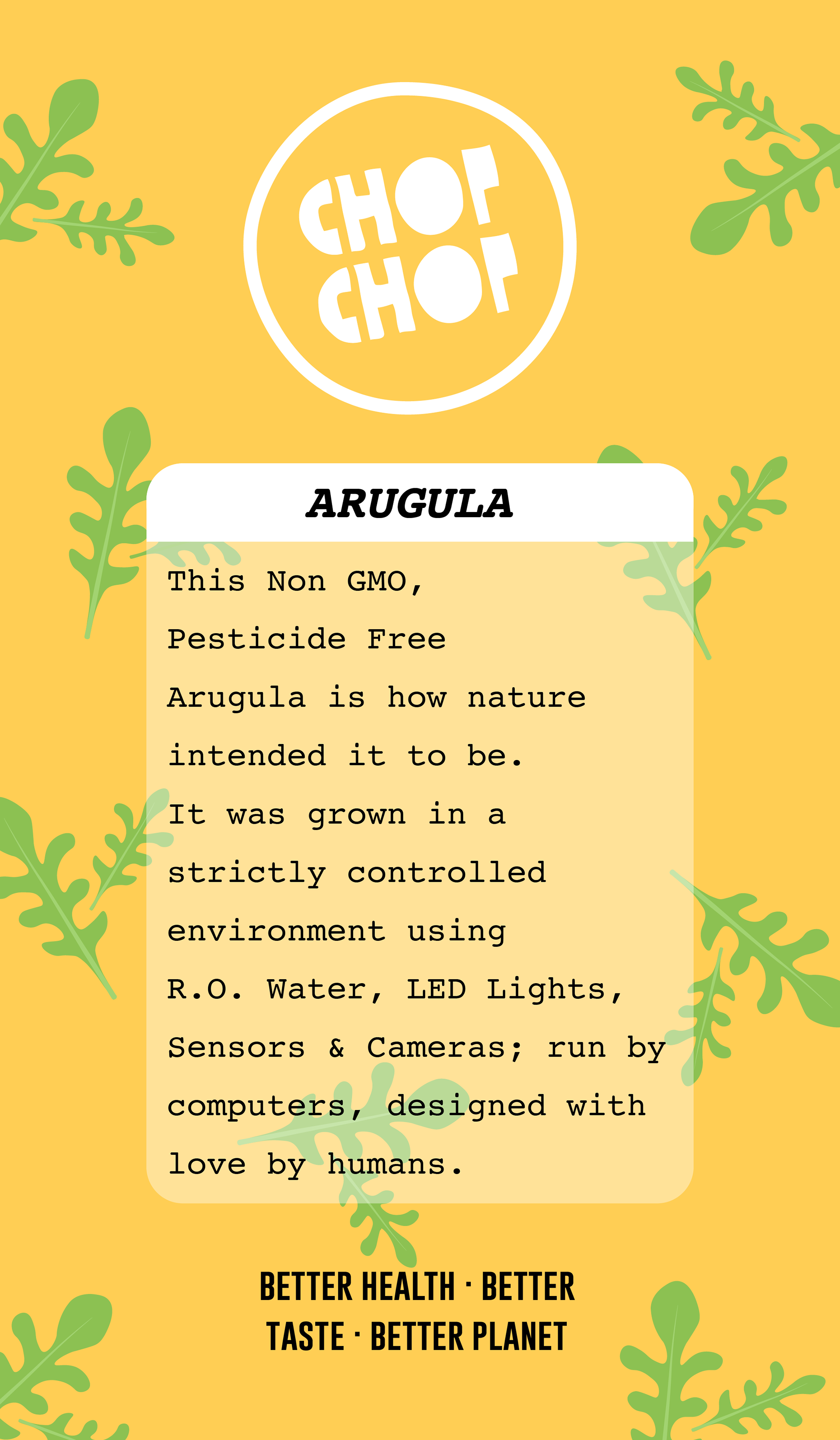
Packaging was designed on similar lines with the help of the illustrations and the chosen colour palette. I chose a bold serif typeface for the titles and a monospace font for the description to create a serious contrast with the other vibrant, freeform elements for the desired balance of trust, fun, and professionalism.
The final step was to create character and method illustrations to be used on website and social media platforms. They were made following the established aesthetic and palette for maximum uniformity.